 This example of a star plot map. This map is showing multiple data with each individual star representing on thing of data. This map is representing the 1979 automobile analysis.
 http://www.itl.nist.gov/div898/handbook/eda/section3/gif/starplot.gif
This example of a star plot map. This map is showing multiple data with each individual star representing on thing of data. This map is representing the 1979 automobile analysis.  This is an example of a stem and leaf plot depicting the infant mortality rate in western africa. The stem represents the first digit in the number sequence and the leaf is the second number.
  This is an example of a histogram map charting the number of students along with average final exam scores. This map is shown by using a bargraph and labeling the bars by using different colors.
  This an example of a parallel coordinate graph. This map shows a numerous amount of information while still having similar ideas. The different lines are labled using different colors in order to try and make it easier to see it.
  This is an example of a triangular plot map showing the percentage of voting between the liberal democrat, labour vote, and conservative vote. This diagrahm, like all other triangular plots, contains three variables that all add up to one constant.
  This is an example of a windrose map. This shows how wind speed and direction change and have to do with eachother. http://www.climate.washington.edu/windrose/Olympia-WindRose.jpg
 This is an example of a climograph map. This map shows average weather for every month of the year by using both line and a bar graph. Contrasting colors are also used in order to be more visualy affective.
  This is an example of a population profile mape. This map is showing the male and femals immigrants that entered the United States in 2004. The light colored blue represents the blue and the dark blue represents the males. Also on the right the ages are listed and broken up in that way.
  This is an example of a scatterplot. This scatterplot map is comparing the age of a husband and wife. The wifes age is shown on the vertical like and the husbands is shown on the horizontal line.
  This is a example of a index value plot map of the average steam flow index in the United States. This maps shows the average steam flow according to a progress of years. It is easy to see the years when the index is high cause you can see a spike in the chart.
  This map is a example of an accumulative line graph or Lorenz curve. The graph is showing the comparison between cumulative pervent of income vs. cumularive percent of population.
  This is a example of a bilateral graph. This graph is using barline a different colored bars in order to show the difference between accepted trainies, dispatched experts, and dispatch of JOCV's. http://www.mofa.go.jp/policy/oda/category/environment/pamph/2001/image/1_3.gif
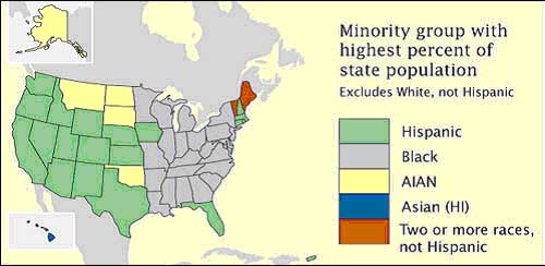 This is an example of a nominal area choropleth map, showing the united states. This choropleth map is trying to display the minority group with the highest percent of state population, excludes whites. The map is using color to identify with each race.
 This is an example of a unstandardized choropleth map, since the information is random. The viewer is unsure of this area but we are able to view the differen percentage of vacancy by zip code. Also, the percentages are shown through the different colors.
 This is an example of a standardized choropleth map, showing the United States. This map is displaying the population per square mile by state, according to information taken in a 2000 census. The different shades of purple represent the different amounts of people in a given area. http://upload.wikimedia.org/wikipedia/commons/thumb/7/78/USA_states_population_density_map.PNG/800px-USA_states_population_density_map.PNG
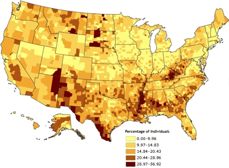 This is an example of a univariate choropleth map, which shows a map using one variable. This is a map showing the United States, and a certain percentage of individuals. The different colors represent the different amount of individuals in each given area.
 This is a Bivariate choropleth map of Russia since it is showing two variables of the same thing. This map is showing two differents themese but for the same idea. One map is showing the people per square km and the other map is showing percentage change. They both are using different colors in order to show the different ranges.
 This is an example of an Unclassed Chloropleth Map since there is no key to explain the different shading around the area. This chloropleth map is attempting at showing the proportion of children age 0-15, using five classes.
 This is an example of a classed chloropleth map showing the United States. The map is displaying the male per 100 female ratio for the 2000 census. The different colors represent the different ratios of men and woman. This is clearly a classes chloropleth also due to the key on the left.
  This is an example of a range graded proportional circle map showing part of the United States. Each different size red circle represents the Mexican population per state. The larger the circle the larger the population of Mexicans and the same for the smaller the circle the smaller amount of Mexicans.
  This is an example of a continuouly variable proportional circle map of West Germany. The different colors in the circles spread throughout the map represent major industries and their influence in each area.
  This is an example of DOQQ map showing the United States. This map is showing NAIP 2005 inspection status of around the country. The different colors represent either phases that have been completed and accepted countries.
  This is an example of a DEM Map. This digital elevation map, showing the different levels of elevation by using different colors. This digital representation also allows for a better view of the different elevations.
  This is a DLG map showing the different areas of elevation around the United States. Thid digital line graph helps to break up each area in order to better study and understand the elevation levels.
  This is a DRG map showing Florida. This is a digital rendition of a tropographic map, focusing on key areas in Florida.
 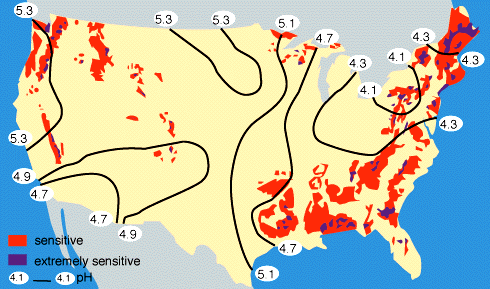 This is an example of a Isopleth map showing the United States. This map is showing the global water and nitrogen cycles by using colors, numbers, and black lines. The numbers represent the PH levels while the color red represents sensitive areas and the purple represents extremely
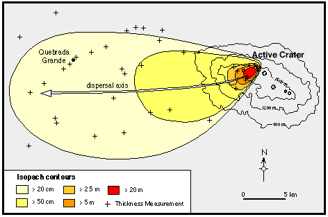 This is an example of an isopach map. This map shows an active crater and the direction it is directed to take. The different colors represent different lengths and the plus marks represent the thickness.
 This is an example of an isohyet map taken of a portion of Mexico. The grid shows the different cordinated of each area and the different colors represent the elevation with red being the lowst and a dark blue being the highest. Other things are represented such as towns.
  This is an example of an isotac map showing current patterns in a portion of the ocean. The different numbers and lines represent the different current patterns being showed. The numbers are each assigned to a different location based on the area.
  This is an example of an isobars map. This map is showing the different levels of wind throughout a portion of the United States. Both the different shapes of the circles. Also the different numbers have special representation with the intensity of the wind and its direction also.
  This is a LIDAR map showing a portion of a city.The different colors show the different levels of height with green being the loswet and a bronz being the highest.
  This is an example of a doppler radar showing a storm over some part of the United States. The different colors show the different levels of intensity od the storm and the amount of rainfall. The viewer can also see the major road ways and counties in the map.
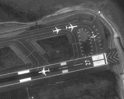 This is an example of a black and white aerial photo showing an airport. The black and white color allows the viewer a more clear view of the airplanes in contrast with the road.
  This is an infared aerial photo of a hurricane. You can see the different levels of intensitiy throughout the hurrican with the different colors. The middle, near the eye, is the most dangerious part of the hurrican and thats why it is labled with red.
  This map is a cartographic animation showing the gulf of mexico. This is a cartographic animation of hurrican katrina before is hit New Orleans. The viewer can clearly see the size and shape of the hurrican and its intensity.
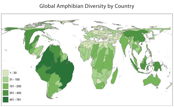 This is an example of a cartogram map of the world. This map shows the Global Amphibian Diversity by country. Each different shade of green represents the amount of amphibian diversity in the given area.
 This is an example of an isoline map showing the United States. This map is displaying the forcast of winds throughout the country. The different levels of wind are being portrayed by the different shades of blue.
 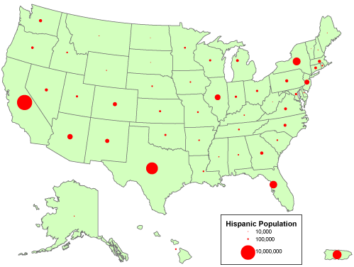 This is a proportional circle map of the United States. The different sizes of the red circles represent the hispanic population in each state. The smaller the circle the small the hispanic population and the larger the cirlce the larger the population.
 This is an example of a Chloropleth map. This map shows the increase in the divorce rate in the United States. The different percentages and numbers are showing here by the different shades of blue.
 This is an example of a dot distribution map of the United States. The Dots are shown using the color yellow showing the cumulative U.S. AIDS cases. The areas in which are the most yellow are the areas that have the most cases.
 This is a PLSS map is a focus on a small area in Minnesota. Every number is important in identifying that certain area in order to obtain the information needed.
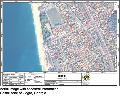 This is a cadastral map showing a beach of the coast of Georgia. This map is displaying clear boundries and streets. The different colors represent different important facts as well.
 This is a topographic map of South America with an emphasis on Brazil. The Map shows the different elevation levels throughout the country and contenent. The different colors represent the different levels of elevation throughout the country.
  This is a plainimetric map of Quebec city. This map is showing the Charlevoix Impact structure and the effects of the areas surrounding it.
  This is a mental map displaying a persons thoughts on how they United States looks along with some other information. The person drew to the best of their ability their memory of the United States, labeled three major cities along with areas in which the Bush family may or may not have control over.
  This is a flow map showing the flow of lava since 1800 on an island in Hawaii. The view can see both the flow of lava by the red lines which appear throughout the island. Also there are different numbers placed in different locations rating the amount of increasing security of hazard.